Disney Languages – Language App – 2023
Over the last year I’ve been learning French with Duolingo. In 2022 I finally went to Disneyworld.
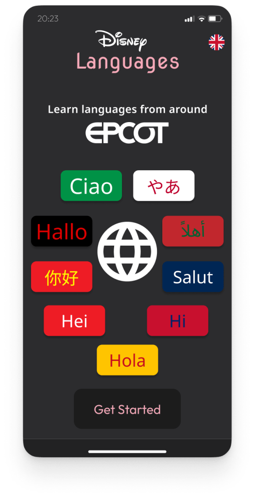
It was on the train home I had a thought of, what id Disney made a language learning app based on location in EPCOT. The park they have many different counties represented in.
The landing screen is each language’s Hello in the language and lined up to mark where in the park they are around the lake.
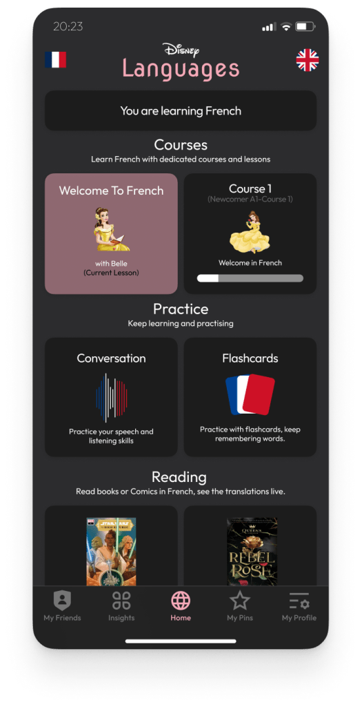
For the language learning I thought it would be cute you learn with a character from that country. For example you would learn French with Belle, who would act as a mascot for the language in the app.
For the learning section I thought about apps I have used, Duolingo, Lingvist and Babbel. Making the learning fun and interactive seems a good way to go. Having the main bulk of learning in Courses, allowing you to practice speaking, listening and remembering words under Practicing. Having the reading section of Disney based books tapping into their wide selection of books.

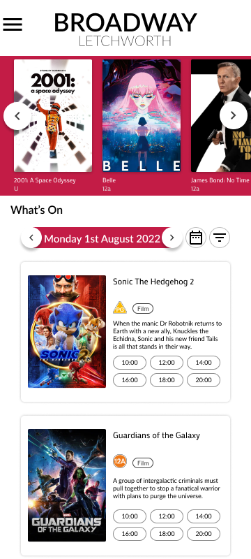
Broadway Palace – Cinema Website – 2023
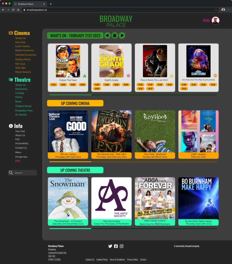
With this design I wanted to do two things. Show the content playing upfront. Make the website feel art deco.
The website is for a small local independent cinema and I feel like the main thing people go to the website is to see what is currently on. I felt the current design makes you scroll to much to find this information out. I wanted to make it so the first thing customers see is the current selection of films that is on then secondly what is upcoming.
They have always had the cinema and theatre different colours so I wanted to incorporate that into the design. I’ve gone for a dark theme, as I find black and gold a more art deco theme. I’ve based the main logo as green for the garden city location the cinema is located in. I made the theatre a bright green to advertise it more and make it stand out as some customers are not aware of the theatre.
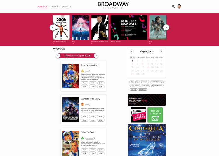
Broadway Letchworth – Cinema Website – 2022
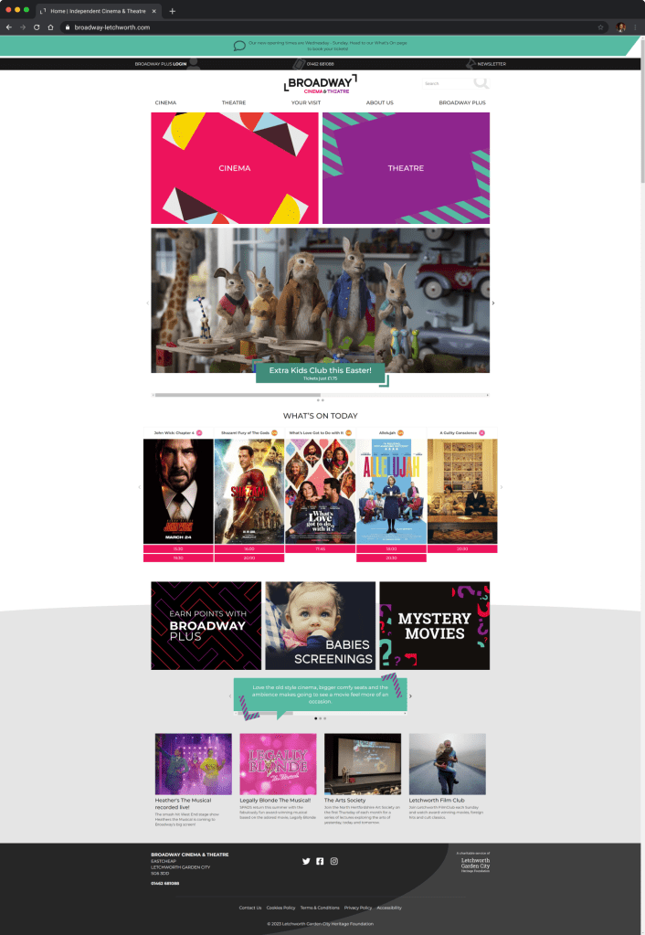
With this design I wanted to make a small change to the way the website was used and make the website feel more modern.
I found the website had a rather good what’s on page for the cinema content. However the main page was a advert filled mess of what was coming or what was on. Only having a small section dedicated to the shows on that day. I wanted to see what I could do by making the home page in the style of the what’s on page. Having the page in 2 columns one with current films on that day and on the other adverts of upcoming show, events & promos. I added the top scroll bar in to add more advertisements as well as it did look bare without them.
For the theme I’ve simplified the page. With only having 3 navigation pages it’s a lot more simple and understanding of where to click. I have incorporated the theatre and cinema together more, by bringing them under one page and just having each show tagged as what it is, rather than feeling like a separate space this brings the building together.